I have been thinking for the past few months about new ways to re-brand The Worb.
The logo was my first hurdle, as deciding on a logo was difficult. I have discussed previously how I find the simple use of the letter ‘W’ to be used quite often. Brands such as Wetherspoons and WordPress use logos that can only be differed because of it’s font. As well as this, since I am relatively fluid in my attempts to describe the true purpose of The Worb outside of creative experimentation on a personal level, it was hard to find an object or a symbol that could creatively encapsulate the meaning of The Worb whilst remaining simple in it’s design.
I initially stuck with the ‘W’ inside of an irregular octagon because it was easy to create. I had used Canva to create it and it worked as a basis for my branding. When The Worb was first created, the website was blue and orange in nature and I was relatively new to the process of designing this website.
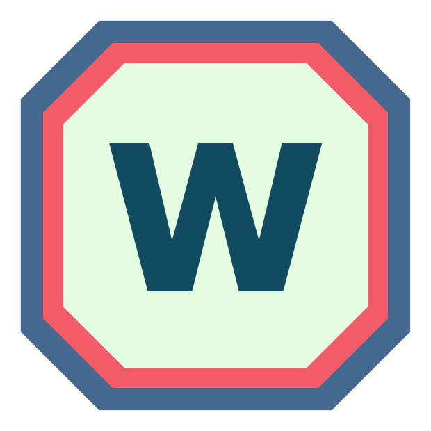
With a small shift in brand colours, the previous logo couldn’t work anymore. For reasons I cannot disclose, I had to delete the old logo too, which meant recreating it from scratch.
To save time I decided to only loosely recreate the old logo. Using Canva again, I used my new brand colours to create it, ensuring to have the middle of the logo the same colour green as the background colour of my website. The new logo also incorporated the Rubik font. A font available across WordPress, Canva and Adobe alike!
This logo worked well for a long time, and it can be seen on my long-form videos (Last Post of Daily Worb Challenge February 2022) and on various cover art including The Worb Podcast and the March 1st song cover:


This all brings me to now. Yesterday, 12th July 2022, I went out for a walk, and whilst feeling tired and zoned out, I sat on a bench and had a look at the pavement surrounding it. It consisted of red bricks forming triangular shapes on the floor. The pavement was part of a small square which was surrounded by benches, and as such, each stone and brick was placed in order to create an even larger pattern.
Because of this, the way a couple of the bricks were laid gave me the idea to start experimenting with that shape, especially with three bricks placed next to each other horizontally, joining by the halfway point.
Yesterday afternoon, I went on Illustrator and created this:
Although the original bricks were red, I needed to find a way to represent the letter W.
In the end, I zoned out 1/6 of the image to my blue colour that I have in brand. The image represents ‘W’ for The Worb and a black dot in the end to represent the website that kicked it all off, altogether forming ‘W.’
This could be represented perhaps as a shortened version of ‘www.’ or ‘theworb.com’.
Either way, after months of searching for something, it came to me in the least expected way, and now I have a new logo which is able to encapsulate what The Worb means, whilst keeping it simple without appearing too basic.
Kind regards,
Worb
